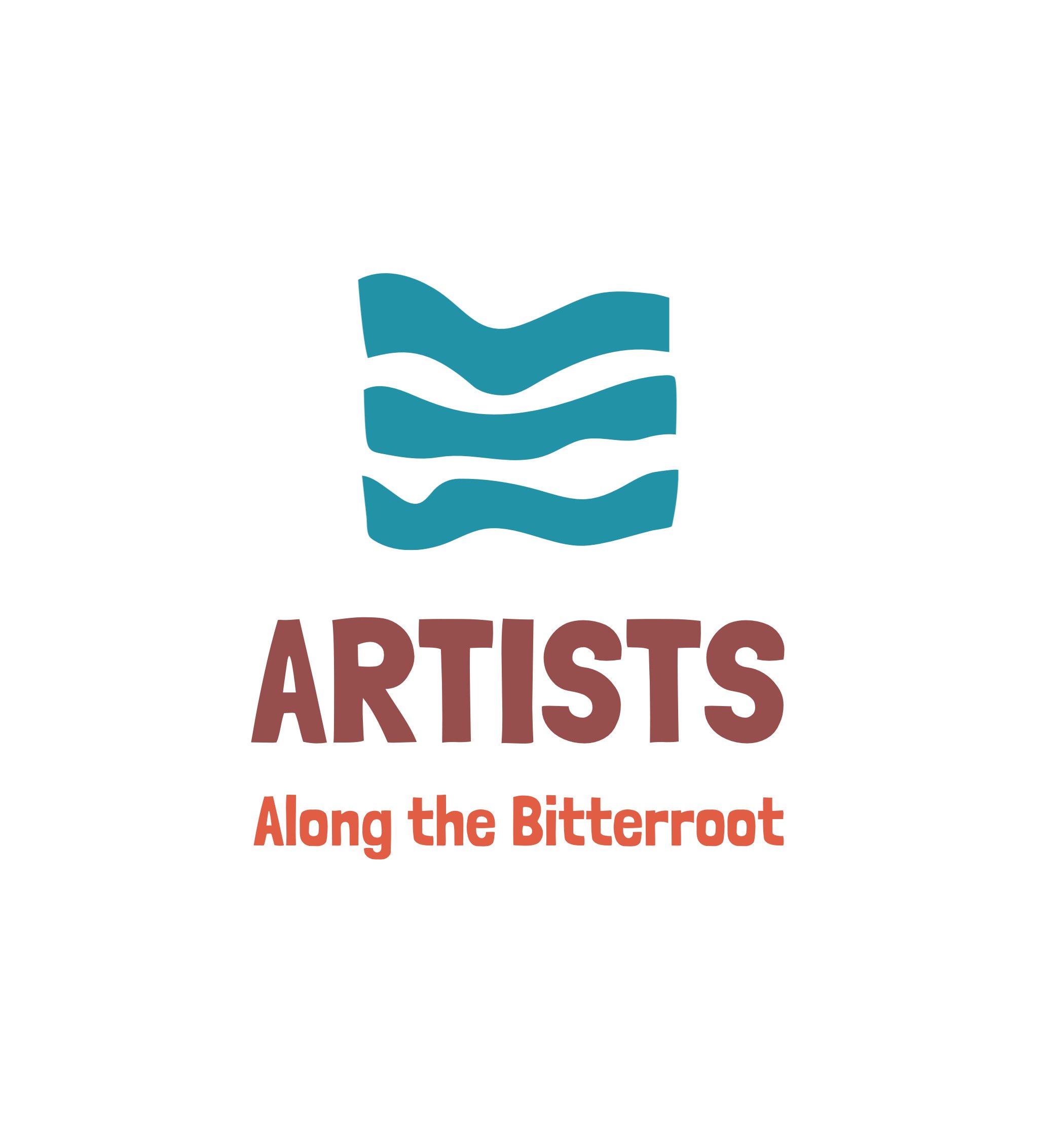
A logo for Artists Along the Bitterroot
Why create a logo for AAB?
Artists Along the Bitterroot has operated for many years without a logo (or branding kit). The green ‘swoop’ that is in use on brochures is dated, leaves little room for original design, and translates poorly to website design, social media and other collateral. There is no consistent use of a typeface. Sometimes the name is spelled out and sometimes it isn’t. We can do better than this!
What makes a logo successful?
Has a basic graphic presence that represents our organization.
We are primarily a group of ARTISTS located in the Bitterroot Valley which is why we chose to emphasize that word.
Easily recognized by our target audience (those who attend our Studio Tours and Art Sales).
Works well both vertically and horizontally.
Translates to color, uses a contemporary color scheme, and works great in black & white.
Uses unique readable typefaces and uses them consistently.
Includes a branding kit with the graphics, typefaces, color palette, and layout rules for how to use the logo in collateral materials (ads, websites, flyers, business cards, t-shirts, etc.)
The AAB Board asked Wendy and Annette to create a logo and branding for AAB. To this end, we have two designs that we feel meet the criteria for a great logo.
Now we are asking you to vote on which one you think best represents AAB out in the world. Please review the two designs below and use the form to vote on the one you think works best. Thank you!
LOGO 1
LOGO 2


